- Ceramics
- Artist Pages
- Asian Ceramics & Tea
- Ceramics Artist Links
- Ceramics Links
- Ceramics Terms Glossary
- Agateware
- Banding Wheel
- Bat, Throwing Bat
- Bisqueware, Biscuit Ware
- Blistering
- Blow Up
- Boat Anchor
- Calipers
- Carbon Coring, Black Coring
- Carbon Trap
- Chuck, Chum
- Coil
- Colorants
- Crazing
- Downdraft Kiln
- EPK, Edgar Plastic Kaolin
- Electric Kiln
- Extrusion, Extruder
- Fettle, Fettling Knife
- Force Dry
- Greenware
- Kaolinite
- Kilnsitter
- Overglaze
- Pinholing
- Plucking
- Pug Mill
- Pyrometric Cones
- Raku
- Rib
- Sgraffito
- Shelf Of Shame
- Slab Roller
- Slip
- Test Tile
- Knowledge
- Frequently Ignored Answers
- Photography
- Photographers
- Photo Links
- Raw File Converters
- Camera Simulators
- Color Vision Games
- Frequently Ignored Answers
- Resources
- Contact
Space
Art elements placed far apart can emphasize the extent of space between them. As elements of a work get closer to each other, they more distinctly define the space between them, emphasizing the shape or volume of the space, which can in turn create interest. As the space between shapes or forms shrinks even more, visual tension builds between them as they near touching, which can be more interesting than if the shapes/forms do make contact.
As a rule of thumb, in an image of a person moving or gazing to one side, it can be beneficial to place the person to one side of center and allow them the larger space to move or gaze into: otherwise it might appear that the figure is staring at the edge of the frame, or about to run into it. Gazing or running toward or off the edge of the frame can be used to make the viewer think about what is happening outside the frame, unseen. Likewise, largely unpictured elements reaching into the frame can make the viewer think about more than what is shown, and spark/leave room for imagination.
Space is often categorized as positive or negative, with positive space referring to the subject or physical mass of the art, and negative space referring to the background or volume around it. Positive/negative space is also known as figure/ground. Usually the positive space is a dark shape on a lighter background - a black figure on a white background, for instance. When this relationship is reversed and the subject is lighter than the background (a white figure on a black background), the shape of the background/negative space becomes more solid and apparent, and may be transformed into a subject itself. This is known as figure-ground reversal.
Perspective and Depth
There are a number of ways to indicate depth or create the illusion of it in a two-dimensional artwork:
- Overlapping objects.
An object that overlaps and partially blocks the view of something else immediately tells us that it is in front of that other thing. Multiple overlapping objects can create greater depth - a person in front of a car in front of a building in front of a country landscape.
- Size.
Objects that are farther away appear smaller: they fill up less of the viewer's angle of view. Human figures, though roughly the same size, diminish the farther away they get; a distant mountain can appear tiny compared to a nearby hill. Everyday things such as human figures, vehicles, houses, etc. of known size can be used to give the viewer a sense of both scale (how big everything else is) and depth.
- Level Of Detail/Focus.
The more distant an object, the smaller it appears, and consequently the less detail we perceive. Depicting more detail in the foreground and less in the background can help create a sense of depth. Too much background detail can flatten an image and distract from the subject. Rendering the most detail in the foreground is not always desirable or necessary to create depth, however. Read more about focus and depth of field.
- Atmospheric Perspective.
Objects that are closer to the viewer have stronger darks and lights and more contrast - distant objects fade into the haze of the atmosphere.
- Color.
All else being equal, warm colors (reds oranges yellows) will tend to appear more forward in space, while cool colors (blue green violet) tend to recede.
- Linear and Curvilinear Perspective.
A system of drawing used to show objects receding in space in the same manner we perceive them in three dimensions. The basic idea is that objects appear smaller as they recede, and therefore parallel lines will appear to grow closer and meet as they reach the horizon (at their vanishing point). Common types of linear perspective include one point, two point, and three-point perspective, referring to how many axis or directions each object is shown to recede to. There is also four, five, and six-point perspective systems, which are curvilinear and can be used to create fisheye views. For the most helpful reading on perspective drawing I've seen, check out Perspective! for Comic Book Artists: How to Achieve a Professional Look in your Artwork
and Vanishing Point: Perspective for Comics from the Ground Up
.
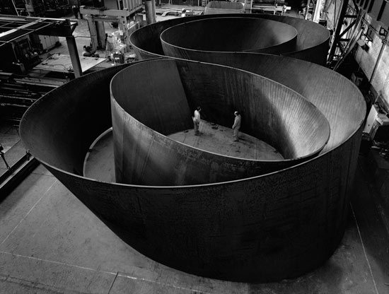
Richard Serra - Sequence, 2006, 12.9 x 40.8 x 65.2 ft., 2 in. thick plate
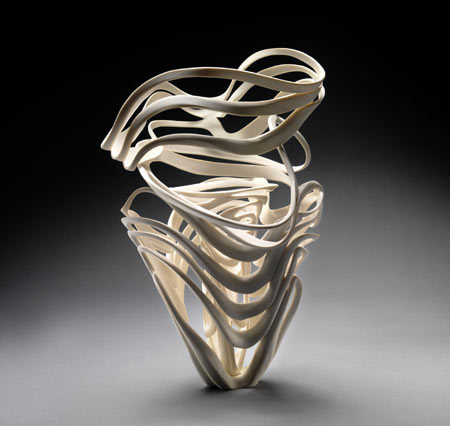
Jennifer McCurdy - Echo Vase, porcelain, 11 x 9 x 9 in.
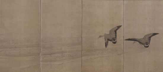
Maruyama Okyo - Geese Over a Beach, 18th century, ink on paper, 176.7 x 372 cm
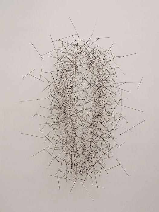
Antony Gormley - Quantum Void II, 2008, stainless steel, 322 x 210 x 90 cm
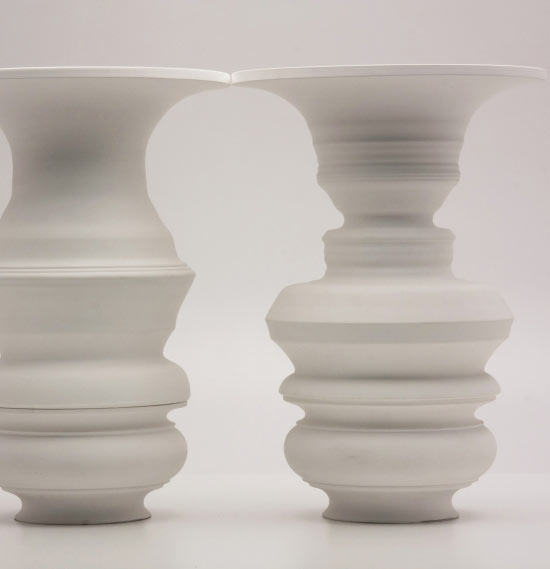
Greg Payce - vase forms, ceramic
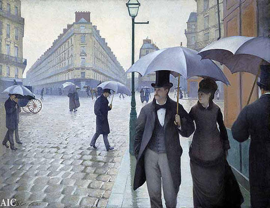
Gustave Caillebotte - Paris Street; Rainy Day, 1877, oil on canvas, 212.2 x 276.2 cm


