- Ceramics
- Artist Pages
- Asian Ceramics & Tea
- Ceramics Artist Links
- Ceramics Links
- Ceramics Terms Glossary
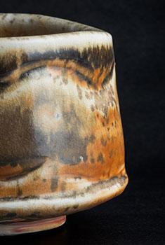
- Agateware
- Banding Wheel
- Bat, Throwing Bat
- Bisqueware, Biscuit Ware
- Blistering
- Blow Up
- Boat Anchor
- Calipers
- Carbon Coring, Black Coring
- Carbon Trap
- Chuck, Chum
- Coil
- Colorants
- Crazing
- Downdraft Kiln
- EPK, Edgar Plastic Kaolin
- Electric Kiln
- Extrusion, Extruder
- Fettle, Fettling Knife
- Force Dry
- Greenware
- Kaolinite
- Kilnsitter
- Overglaze
- Pinholing
- Plucking
- Pug Mill
- Pyrometric Cones
- Raku
- Rib
- Sgraffito
- Shelf Of Shame
- Slab Roller
- Slip
- Test Tile
- Knowledge
- Frequently Ignored Answers
- Photography
- Photographers
- Photo Links
- Raw File Converters
- Camera Simulators
- Color Vision Games
- Frequently Ignored Answers
- Resources
- Contact

Contrast
The difference in quality between two instances of an art element, or using opposing qualities next to each other. For example, black and white (contrasting values), organic/curvy and geometric/angular (contrasting lines/shapes/forms), and rough and smooth (contrasting textures).
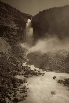
The greater the contrast, the more something will stand out and call attention to itself. This applies to whole works of art as well as areas within an artwork. Areas with greater contrast in value (stronger darks and lights) will tend to appear more forward in space, as over distance atmospheric haze lessens contrast (atmospheric perspective). Contrast can also be used to set the mood or tone of the work. High contrast makes a work more vibrant, vigorous, brash, lively - it "pops" more. Low-contrast work is more quiet, calm, subtle, reflective, soothing.
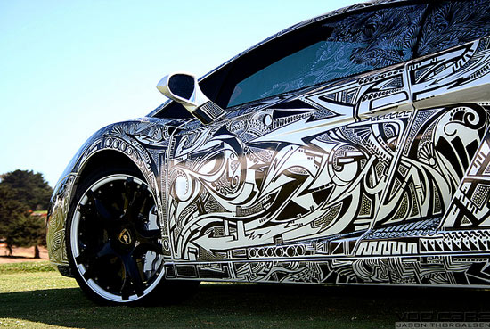
Jona Cerwinske - Sharpie Lamborghini, 2007?, sharpie marker on Lamborghini Galladro
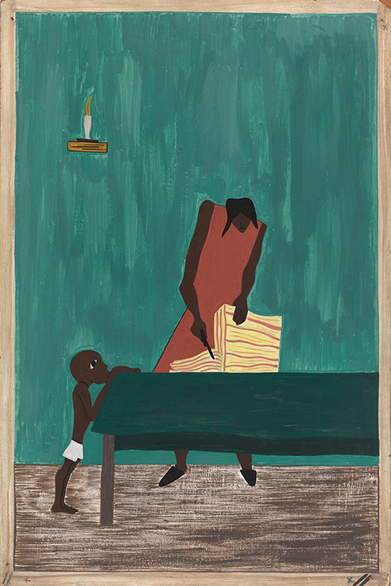
Jacob Lawrence - The Migration of the Negro, Panel no. 11, 1940-1941, casein tempera on hardboard, 18 x 12 in. The red of the figure stands out against the complementary green colored background: the contrast, along with the pose, gives the figure energy and emotion.
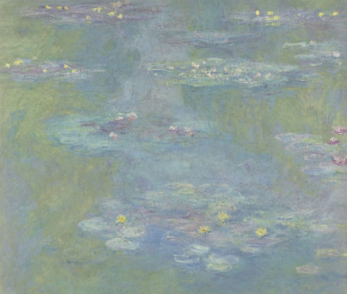
Claude Monet - Nympheas, 1908, oil on canvas, 36 x 37 in. The limited contrast of colors, values and shapes creates a calm, soothing feeling (unless you have a phobia of water lilies).

time well spent
time to explore
time flies