- Ceramics
- Artist Pages
- Asian Ceramics & Tea
- Ceramics Artist Links
- Ceramics Links
- Ceramics Terms Glossary
- Agateware
- Banding Wheel
- Bat, Throwing Bat
- Bisqueware, Biscuit Ware
- Blistering
- Blow Up
- Boat Anchor
- Calipers
- Carbon Coring, Black Coring
- Carbon Trap
- Chuck, Chum
- Coil
- Colorants
- Crazing
- Downdraft Kiln
- EPK, Edgar Plastic Kaolin
- Electric Kiln
- Extrusion, Extruder
- Fettle, Fettling Knife
- Force Dry
- Greenware
- Kaolinite
- Kilnsitter
- Overglaze
- Pinholing
- Plucking
- Pug Mill
- Pyrometric Cones
- Raku
- Rib
- Sgraffito
- Shelf Of Shame
- Slab Roller
- Slip
- Test Tile
- Knowledge
- Frequently Ignored Answers
- Photography
- Photographers
- Photo Links
- Raw File Converters
- Camera Simulators
- Color Vision Games
- Frequently Ignored Answers
- Resources
- Contact
Proportion And Scale
The Golden Ratio, Section, Mean, Rectangle, Spiral, Etc.
The golden ratio is a recurring relationship found in math, art and nature, and is thought by many to be inherently aesthetically pleasing. In its many forms it boils down to approximately 1.618: a rectangle with dimensions 1 x 1.62 could be called a golden rectangle. More elegantly and interestingly expressed, two quantities, a and b, are in the golden ration if a is to b as a + b is to a.
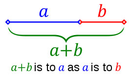
The golden ratio is said to be the basis of the proportions of many works of art and architecture, including most famously the Parthenon. However, like conspiracy theories, once you start looking for golden ratios, you can find them everywhere, to absurdity. Whether the artist intentionally employed the ratio, and whether it helps make the work more aesthetically pleasing, can sometimes be open to debate.
The Rule Of Thirds
As a compositional rule of thumb, the rule of thirds states that it's a good idea to imagine the picture plane divided into thirds horizontally and vertically, and then to align or place key elements along these guidelines or at their intersections. Placing the subject and/or the horizon off-center allows more room for important areas and can create interesting asymmetry. If the subject is moving, emphasis can be given to where the subject is coming from, or where the subject is going to.
A centered composition is more formally balanced and at rest, and places all attention on the subject. Placing a subject at center can also be used to make the subject more confrontational and in-your-face.
The same idea may be applied to three-dimensional art. A vase might look more pleasing if it swells to its widest 2/3 of the way up rather than at the middle.
Good artists will neither slavishly follow this "rule" nor automatically center everything in the middle of the canvas or viewfinder. Rather, they will consider what they want to convey, experiment, and then choose the composition and proportions that best help express their intent.
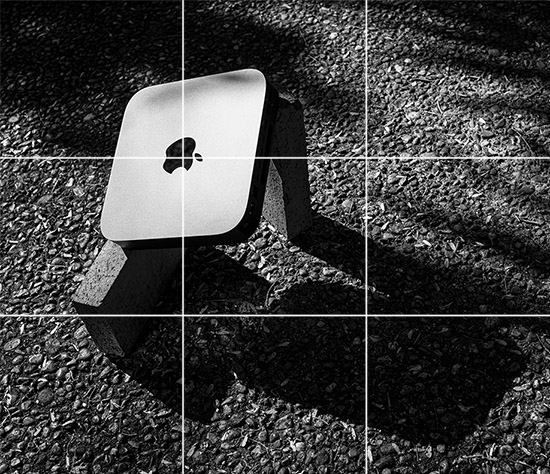
Robert Flye, Still Life with Three Bricks, 2020. (That third brick? That third brick used to serve this website until I tried to revert back from macOS Catalina in the middle of a global pandemic . . .)

Slinkachu - Relics, 2010
Miniature scale

Robert Smithson - Spiral Jetty, 1970, mud, precipitated salt crystals, rocks, water, coil 1500' long and 15' wide
Monumental scale

Jim Denevan
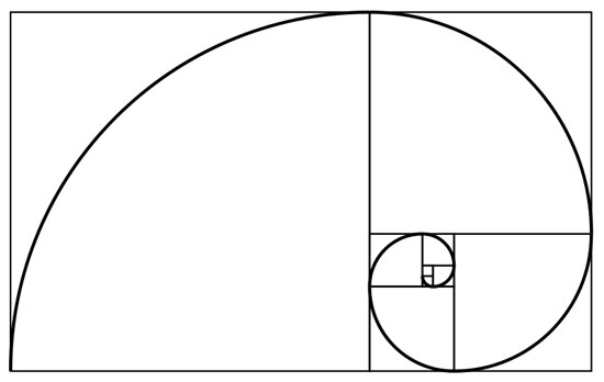
Fibonacci Spiral
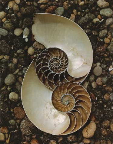
Edward Weston - Nautilus shells, 1947, Kodachrome, 9.75 x 7.75 in.
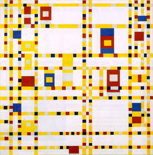
Piet Mondrian, Broadway Boogie Woogie, 1942-1943, oil on canvas, 50 x 50 in.
Some say Mondrian based his grids on the golden ratio.
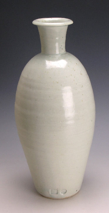
Bernard Leach - Tall Bottle, porcelain, 30cm


