- Ceramics
- Artist Pages
- Asian Ceramics & Tea
- Ceramics Artist Links
- Ceramics Links
- Ceramics Terms Glossary
- Agateware
- Banding Wheel
- Bat, Throwing Bat
- Bisqueware, Biscuit Ware
- Blistering
- Blow Up
- Boat Anchor
- Calipers
- Carbon Coring, Black Coring
- Carbon Trap
- Chuck, Chum
- Coil
- Colorants
- Crazing
- Downdraft Kiln
- EPK, Edgar Plastic Kaolin
- Electric Kiln
- Extrusion, Extruder
- Fettle, Fettling Knife
- Force Dry
- Greenware
- Kaolinite
- Kilnsitter
- Overglaze
- Pinholing
- Plucking
- Pug Mill
- Pyrometric Cones
- Raku
- Rib
- Sgraffito
- Shelf Of Shame
- Slab Roller
- Slip
- Test Tile
- Knowledge
- Frequently Ignored Answers
- Photography
- Photographers
- Photo Links
- Raw File Converters
- Camera Simulators
- Color Vision Games
- Frequently Ignored Answers
- Resources
- Contact

Harmony And Unity
Similarity - Items with similar or identical characteristics - size, shape, color, etc. - will be thought of as a group by the viewer. A few similar elements throughout a work can help the whole work cohere. Like corn starch or gelatin in cooking, you want enough, but too much can take away variety (and in food, make it like rubber).
Continuance - An art element that has direction - a line, edge, spiral, path leading back in perspective, the direction a figure is gazing or moving, or any shape or form that stretches out - will tend to point the viewer's attention off in that direction. The viewer's eye will keep on looking in that direction, skating off beyond the element, until another significant element stops or redirects the viewer's gaze. This means a dominant pointing element can lead the viewer's gaze out of the picture, which might not be desired, unless countered by something that blocks or deflects attention back into the picture. Using continuance, small cues can be used to steer attention around the whoe work.
Closure - Our brains like to fill in the blanks and complete things, much like a phone guessing at what you're trying to text as you type. Small parts can be used to suggest a whole; a few corners or a dotted outline can conjure up a whole shape. Not explicitly showing the viewer everything, leaving her room to work some parts out for herself, can create a more rewarding experience.
Proximity and Alignment - Things that are close together or aligned with one another will be lumped into a group by the brain, even if they are very dissimilar. The more similar, closer or aligned the elements are, the more strongly they will be read as a group.
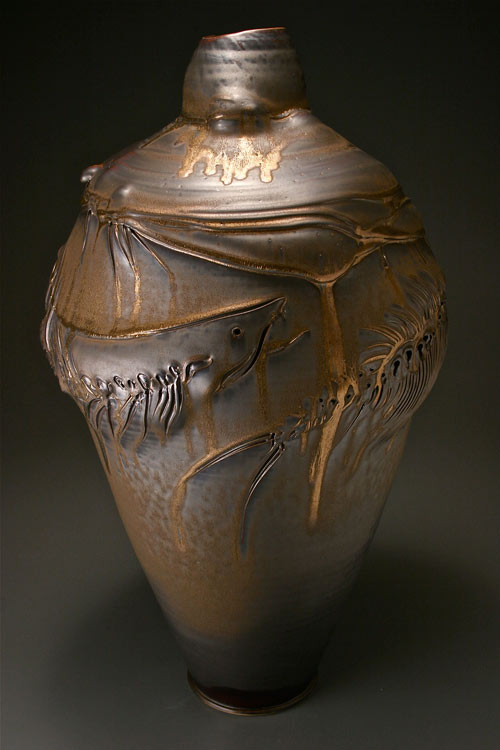
Tom Coleman and Frank Boyden - white stoneware, 25 x 15 in. The loose flowing form and bronze color, similar to river stones, form a natural backdrop for the fish. The fish swim around the pot, pointing the gaze on and up, while the ridges at the shoulder of the vase act like the surface of the water, helping frame the fish and keeping them and attention from jumping away. Metallic highlights gleam from the fish and top of the vase, catching attention, while the bottom gets darker like deeper water, fading from view.
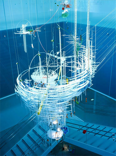
Sarah Sze - Sarah Sze, 2005.
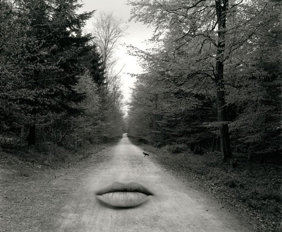
Jerry Uelsmann - Untitled, 2000. We are used to seeing women's lips on women's faces, so our brains try to make sense of and complete the image. The bilateral symmetry of the road and sky dividing the trees echoes facial symmetry, subtly hinting at upper lip, nose and forehead; the crow on the road could suggest a beauty mark. The lips heighten our sense of the scene, conjuring a not-quite-seen presence that the woods might make us feel in person.

Andy Goldsworthy - Woven bracken ball, Langholm, Scotland, November 1985
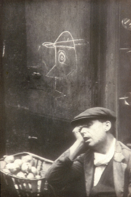
Henri Cartier-Bresson - Barrio Chino, Barcelona, 1933, gelatin silver print, 13.5 x 9.25 in.
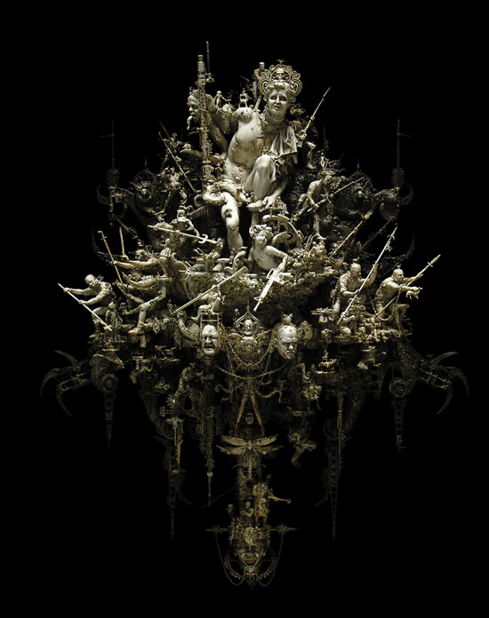
Kris Kuksi - Ode To Herculaneum, 2011, mixed media assemblage, 17.5 x 22 x 6.5 in.

time well spent
time to explore
time flies