- Ceramics
- Artist Pages
- Asian Ceramics & Tea
- Ceramics Artist Links
- Ceramics Links
- Ceramics Terms Glossary
- Agateware
- Banding Wheel
- Bat, Throwing Bat
- Bisqueware, Biscuit Ware
- Blistering
- Blow Up
- Boat Anchor
- Calipers
- Carbon Coring, Black Coring
- Carbon Trap
- Chuck, Chum
- Coil
- Colorants
- Crazing
- Downdraft Kiln
- EPK, Edgar Plastic Kaolin
- Electric Kiln
- Extrusion, Extruder
- Fettle, Fettling Knife
- Force Dry
- Greenware
- Kaolinite
- Kilnsitter
- Overglaze
- Pinholing
- Plucking
- Pug Mill
- Pyrometric Cones
- Raku
- Rib
- Sgraffito
- Shelf Of Shame
- Slab Roller
- Slip
- Test Tile
- Knowledge
- Frequently Ignored Answers
- Photography
- Photographers
- Photo Links
- Raw File Converters
- Camera Simulators
- Color Vision Games
- Frequently Ignored Answers
- Resources
- Contact
Color
The three properties of color:
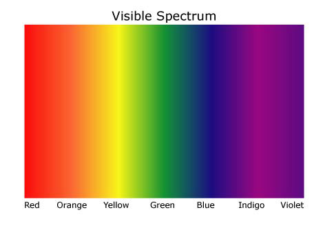
Hue – The name of the color (red, green, etc.)

Intensity or Saturation – The purity (brightness or dullness) of the color. Pure red is bright; red mixed with a little green (its complement, opposite it on the color wheel) becomes less intense, more neutral.
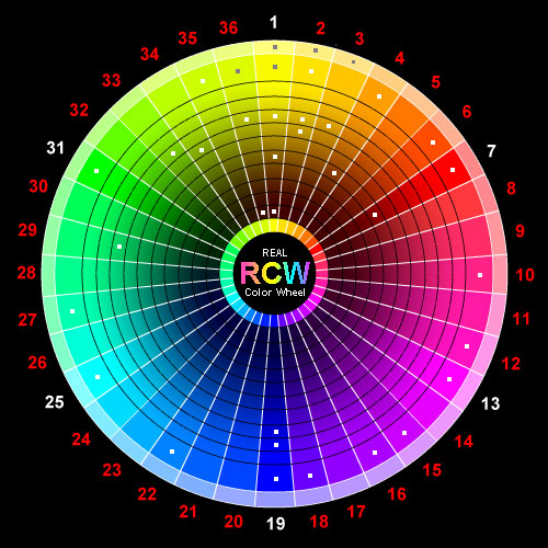
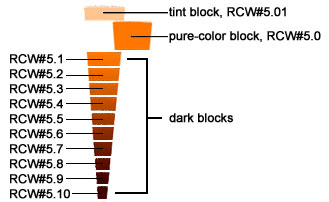
Value or Brightness – The lightness or darkness of a color. How much white or black shows through or is mixed in. Can be used to depict light and shadow on a color and help show volume/form.
Tints, Shades, and Tones

Tint. A hue with white added to it, or applied thin enough so that a white background material (paper, canvas, etc.) shows through.

Shade. A hue with black added to it.

Tone. A hue with gray added to it.
Color Temperature
Warm colors. Reds, oranges and yellows are said to be warm colors because of their visual relationship to sources of heat and light. Objects or elements with these colors will tend to appear energetic and exciting, as well as more forward in space.
Cool colors. Blues, greens and violets are said to be cool colors. Objects or elements with these colors will tend to appear calming and soothing, as well as farther back in space.
Neutral colors. Blacks, grays, browns, tans, beiges, and whites. Browns, tans, and beiges are slightly warm; blacks, grays, and whites can be slightly cool or warm. Neutral colors, with their low intensity, do not clash with other colors. They can serve as backgrounds, help tie together broad ranges of colors, and balance out more intense colors that would be overpowering on their own.
Color Schemes or Harmonies
-
Monochrome – Using only one color.
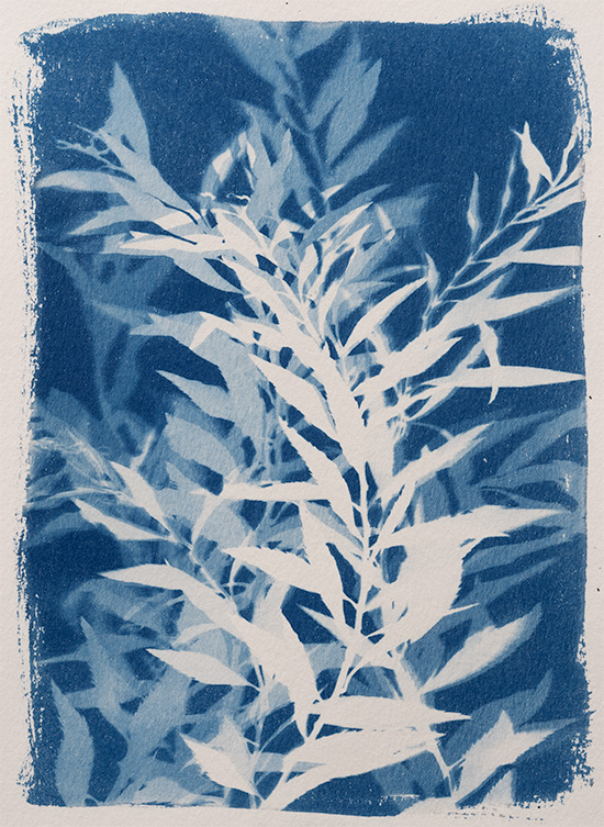
Kelsey MacKenzie, 2022, cyanotype
-
Analogous – Using colors next to each other on the color wheel.
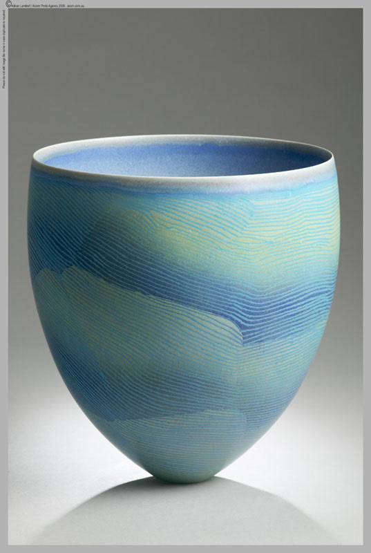
Pippin Drysdale - from Tanami Trace Series IV - V, 2006
-
Complementary – Using colors opposite each other on the color wheel.
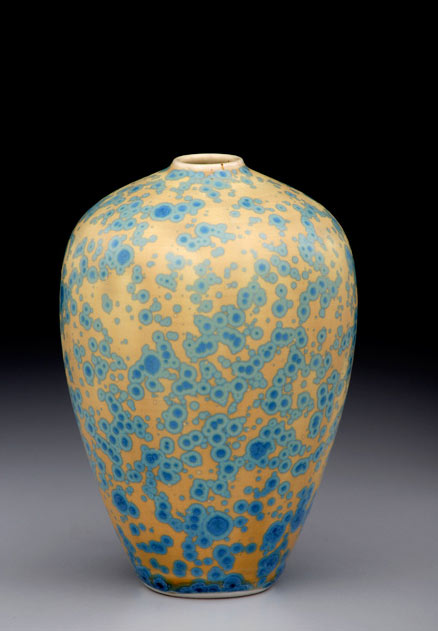
John Tilton - porcelain with matte crystalline glaze, 5.75 x 3.25 in.
A number of other color schemes exist, along with volumes of additional information. You may wish to additionally see:
- Color Theory and Color Vision - very in-depth examinations of the subjects by Bruce MacEvoy at Handprint.com
- Paletton Color Scheme Generator
- Adobe Color Palette Generator
But Wait, There's More! . . .
Digital Color
So you take paints or colored pencils or pens or pastels and you practice blending colors and make your very own color wheel in art class, and you are now Master of the Visible Spectrums of the Infinite Universe - and you're okay with that. You've got a clue, and maybe even a hue. You could probably use your skills to make a Highly Visible Sign asking someone to a dance. Then you get on a digital thingy and open up Photoshop or some other image editing app, and hey there's a function to INVERT COLORS! Yes! So you make a big fat red square in the program and then select a circle in the middle of it to invert. With your color wheel knowledge you think, "I am going to hit the magic button and turn RED into GREEN", its opposite or complementary color. You hit the magic button, and . . .
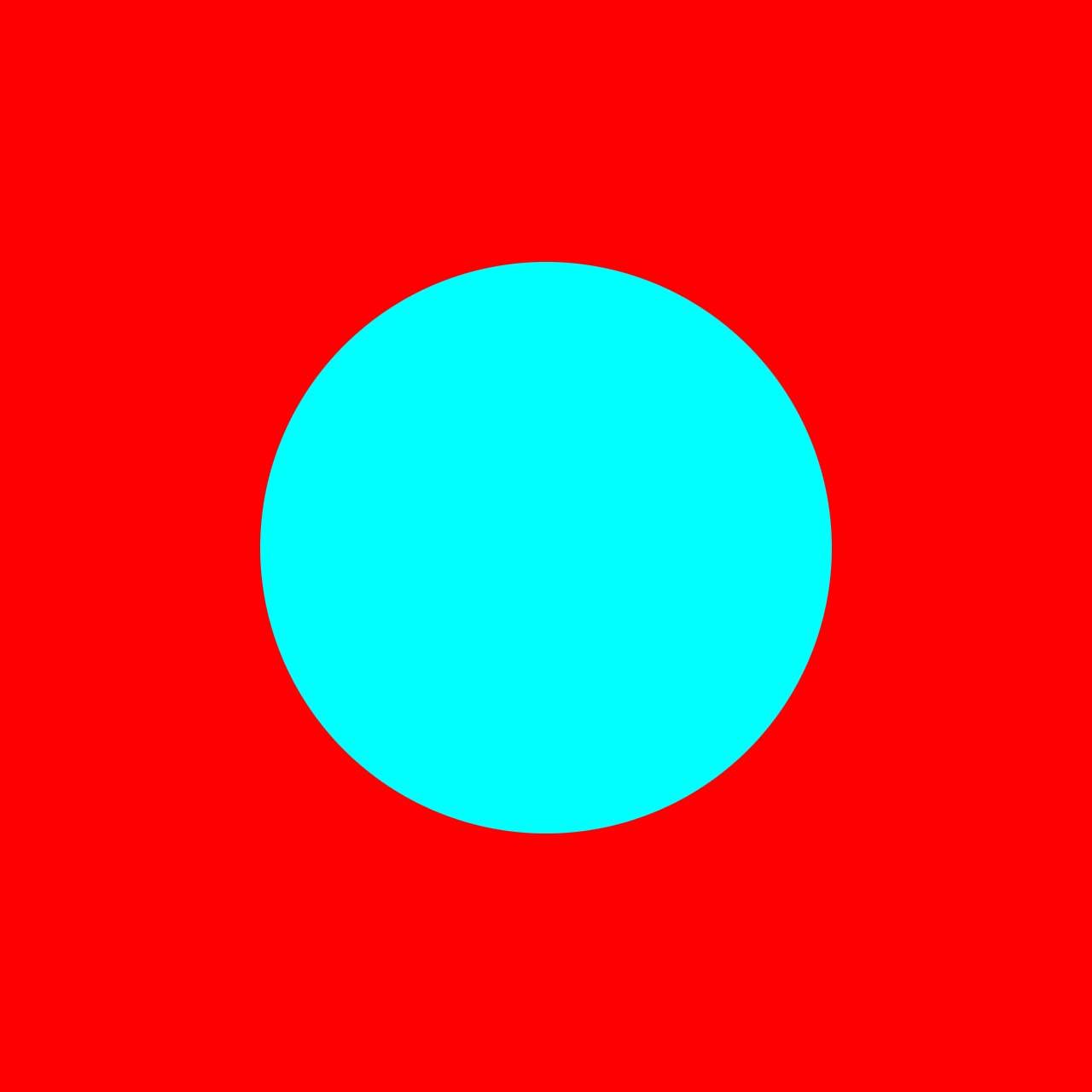
Waaaait - that's not green! That's cyan! What the heck's the scoop?
Turns out we've learned a thing or two since Sir Isaac Newton created the first color wheel in 1706.
We now know that there are three types of the light-sensitive cone cells in our eyes' retinas: the majority sensitive to reddish light, the minority sensitive to greenish light, and a couple percent sensitive to blueish light. Signals from these cells are interpreted by our brains so that we perceive not only these colors of light, but the combinations of these colors as well. Isaac Newton and Pink Floyd beamed white light through a prism and showed that it was made up of all the different colors combined.
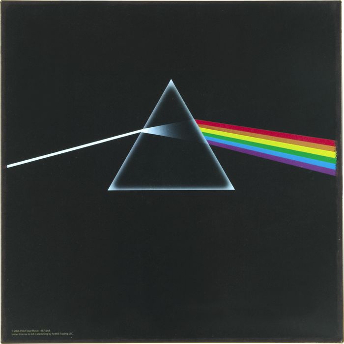
Newton then took his scientific version of a color wheel and spun it around fast; the colors all blurred together and the viewer perceived the wheel to turn white.
Relevent to digital color:
RGB Color
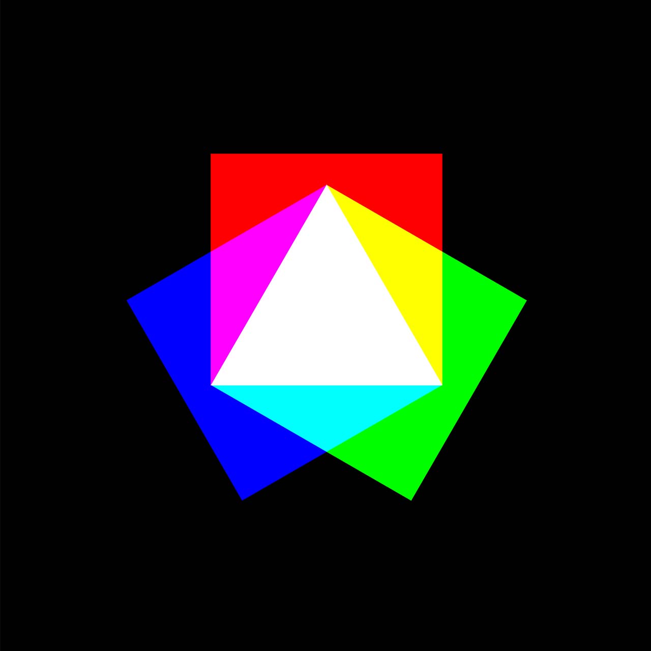
Digital display images are composed of pixels, and each pixel is composed of three sub-pixels: one emits red light, one blue light, and one green light. Varying the intensity of light each sub-pixel emits changes the perceived color of the pixel. This scheme of using red, green and blue light to create all the colors of a display is known as RGB color.
When you shine two or more different color lights together, the light and colors ADD TOGETHER - they are said to be addative. Shine red light and blue light together and yo get magenta; shine red and green light together and you get yellow.
CMYK Color
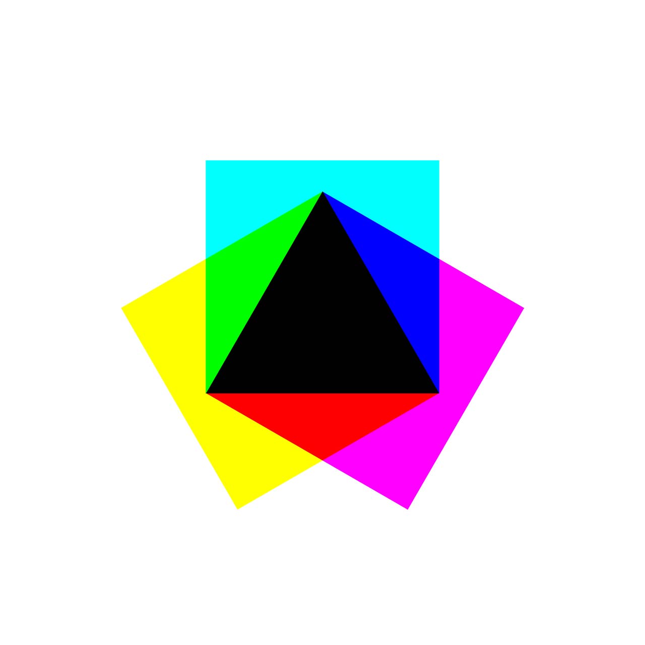
Printing colors is a whole different can of monkeys. Paints, inks etc. work by subtracting light. White light (composed of all colors of light, remember) hits a white piece of paper, and all the light is reflected, so we see white. When a red square is printed on the paper, white light hits the red square, and the red ink absorbs, or subtracts out, all the light but red, so only red light is reflected from it. In this case, red ink plus green ink would not add to yellow, but subtract out most light from reflecting until to create a near black color.
In this subtractive color scheme, the primary colors used to generate all other colors are Cyan, Magenta, Yellow - and blacK. CMYK for short - this is subtractive color. Cyan + Magenta gives blue, Magenta + Yellow gives red, etc. Cyan + Magenta + Yellow would give dark dark gray/black, but it would also use a ton of ink, so black ink is also used. Today, printers sometimes use a larger array of inks to output smoother gradations and a wider range of color. (For instance, the Canon ipf6400 in the classroom uses two types of black (one for glossy and one for mat paper), two shades of gray, two shades each of cyan and magenta, yellow, and also red, green, and blue).
Color Spaces
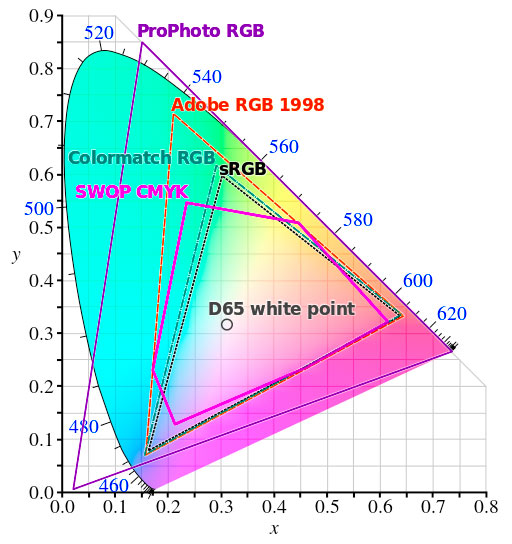
"CIE1931xy gamut comparison" by BenRG and cmglee
A color space is the range of all possible colors that can be printed or displayed by the given color system or technology. The colorful "horseshoe" shape in the above diagram represents all the colors our eyes can perceive. Starting from the bottom right corner of the diagram at about 700 nanometers at red, the colors at the edge of the color space are pure unmixed colors that move through the rainbow as you follow the edge up and around, to orange, yellow, lots of green, and a very little blue, indigo and violet. Inside the border are colors created from mixing these outside colors.
Within the visible spectrum are smaller color spaces. Displays and projectors and the web use sRGB, the additive color of light. Printing at some point boils down to using some form of CMYK, subtractive color created by combining inks. A couple things to note:
- sRGB is the smallest of the RGB color spaces - it doesn't have the range of color of Adobe or ProPhoto RGB. This means setting your camera to record Adobe RGB instead of sRGB could give you images with a slightly wider range of color. As image capture and printing technologies advance, using the widest color space you can could yield more perceptively better color. The downside is that the world runs on sRGB at the moment, and unless you know what you're doing your images will look duller, not richer. But only until you do know what you're doing. If you capture things in sRGB, you can't regain wider gamut data later.
- More of an issue, sRGB (what you see on yor monitor) and CMYK don't completely overlap. Your display can show you colors you can't print, and you can print colors that your monitor can't display. This can make life fun when trying to make a print look like what you see on the screen. Adobe and ProPhoto RGB do a better job of encompassing CMYK.
- A smart student, looking at the color space diagram projected on a screen, asked how we could be seeing all the colors of the wider color spaces when using just an sRGB projector. The answer of course is we were not; we were seeing a comparative representation of those color spaces (of unknown accuracy).

Bit depth
Another artifact of the digital world is that everything is recorded as collections of ones and zeroes, or bits. The number of bits used to record color determines the possible number of colors that can be displayed. One bit will give you two values, black and white; two bits will give you four values, three bits will give you eight values, etc.
Standard sRGB pixels are composed of red, green and blue subpixels, and each of these is an eight bit value, meaning it can be anywhere from 0 to 255. 256 reds x 256 blues x 256 greens = 16,777,216 possible colors. Seems like a lot until you start working with gradations, especially in shadow areas, and what should be a smooth transition becomes a series of bands of color (called color banding).

Using greater bit depth (more bits per color channel) can help record more tonal detail and keep color transitions smooth. Currently (2015) the JPEG file format used by online imagery, and that most consumer digital cameras default to, only supports 8-bits, but many cameras can also save "raw" files - raw image data - at a higher bit depth. Raw files are larger and more awkward to work with, but can record 12 to 16 bits per channel. If you want the best image quality you can get, shoot raw.
Color Values
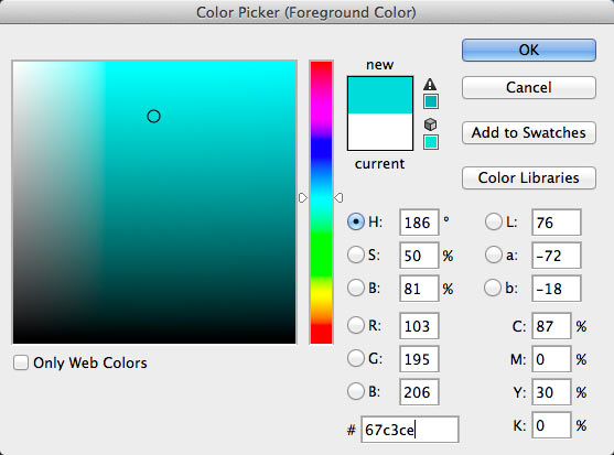
This can come in handy when you're doing HTML or geeking around with color and color matching, or you simply want to know what color codes look like and mean. In HTML, 8-bit color values are written out as six-digit hexadecimal numbers (decimal = 0-9 = ten possible values; hexadecimal = 0-9 + A-F = 16 possible values) prefaced by a pound sign (hashtag to you noobs). For example, #1A2B3C = a dark blue of medium saturation. The first pair of numbers (1A) is for the red channel or red sub pixel, the second (2B) for green, and the third (3C) for blue. A value of 00 means no light of that color while a value of FF ( = decimal value of 255) means 100% brightness. Pure red would be #FF0000, pure green #00FF00, pure blue #0000FF, pure black #000000 and pure white #FFFFFF. Grays of various brightness are created by making all the color channels equal values, for example #A5A5A5 would be a medium-light gray.
When software dealing with color breaks the values down into their separate channels, the values are written (or you enter them) in decimal form, from 0 to 255, for RGB. CMYK values are percents. Hue, Saturation and Brightness (HSB) is another way to map colors, and Lab is another very wide-range color space good for advanced tricks. The image below shows a screenshot of the color picker from Photoshop.
